
Overview
Adding live data objects to a sign is a great way to present dynamic content. There are many different ways to arrange the layout of these objects on a sign. Here are some of the ways we find the most helpful.
Before You Begin: Create a live data object and add it to a sign. Some types of live data objects are:
In Content Manager, right-click the live data object and click Edit Source Content Layout.
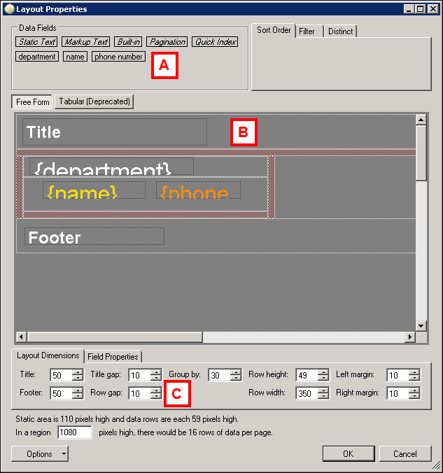
Layout Properties
Below is a description of the various areas of the Layout Properties window. The letters correspond to the matching areas on the screenshot.
| Letter | Name | Description |
|---|---|---|
| A | Data Fields | The data fields available to use on the sign appear at the top of the window. Those in italics are provided as a default by the Content Manager software. Those in regular type are pulled from your data source. Drag the fields you want to display on your sign down to the Free Form area below. |
| B | Free Form Area | This is where you arrange the data fields. It consists of static area and row area. The static area is Title, Title gap, Footer, and Row gap. Their sizes are defined in the Layout Dimensions tab below. Click inside the static field to change its text. In between static areas is the row area where you can arrange the dynamic fields from your data source and adjust their size. Drag them into place and drag their borders to resize them. Select any field to display its placement and size values in the Field Properties tab below. |
| C | Layout Dimensions | This is where you adjust the size of the static areas and the row of dynamic data from your data source. |
| D | Field Properties | This is where you adjust the size values for the static and dynamic fields. |
Customize Data Fields
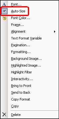
To customize a data field, right-click anywhere inside the data field, and select what you wish to customize: font, size, color, alignment, format ,etc.
We recommend using AutoSize, which will automatically resize the font to fit the area, preventing any text from being cut off.
Additionally, fields that are already designed can be copied or have their layout copied and applied to other data fields in the layout (right-click and select copy or copy format).
Simple Photo Layout - Full Sign
First, set up how you would like the region to be laid out by adjusting the static areas and row height and width. This is just to determine how much space you want to allocate for the title and footer (if any), and how many rows of data you want to display on your sign.
Next, drag the data fields you would like to use into the Row Area.
This is the simplest layout. There are no title, footers, gaps, or margins (all set to 0). The Row height is set to the entire region (1080).
Here, the data field used was markup text with a URL to the shared network folder where the actual photo files live. See Manage Data Using External File for instructions on how to set this up.
At the end of the file path in the markup text field, add the header name of the filename column in curly brackets from your source file.
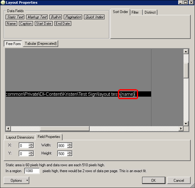
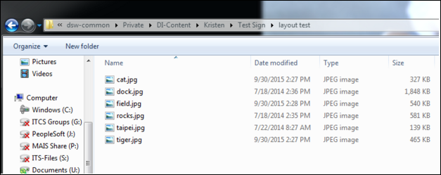
In this example, the header name for the photo filename is Name, so {Name} is added to the end of the file path.
Note: this only works with image files, no PDF’s.
The example displays on the sign as:

Note: The black bars on the sides of the display are caused by the preview in the Content Manager. Click actual size to remove them.
Simple Text Layout and Group By
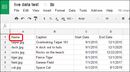
This is an example of a simple text layout. The data source used is a google sheet:

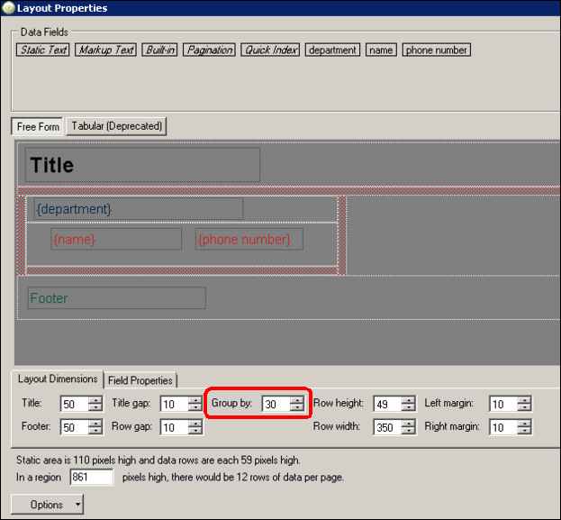
The Group By area is set to 30, and determines which category the data is shown. The “department” data field was dragged down into the ‘Group By’ area, so the data is being grouped by department.
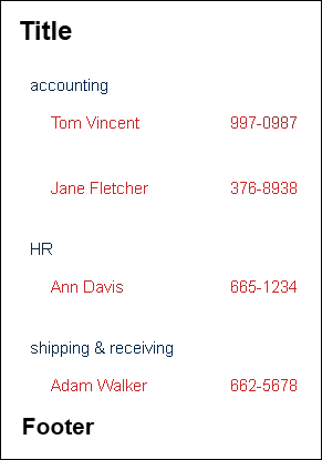
The example displays on the sign as:
Multiple Rows
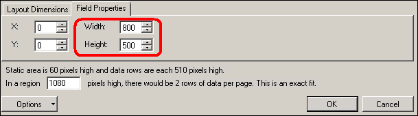
To add more than one row area, reduce the size of the row height. Here, the row height and width has been decreased to 500 and 800 pixels, giving enough room for 2 rows to display in the region (1080).
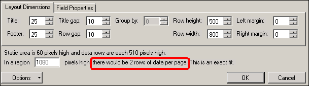
When you change the row height and width in layout dimensions, you have to change it in the field properties too.
This example displays on the sign as:

Multiple Columns
Click Use Multiple Columns from the Options menu in the lower-left of the Layout Dimensions area.

This displays as many columns that will fit in the selected region (1920 in this example), depending on how wide you have the Row Width set (800 here). Two columns of rows 800 wide will fit in a region that is 1920 wide: